rbtl - Data Visualisation
Lars Schöbitz
Global Health Engineering - ETH Zurich
2022-05-05
Today
- Research Project Report
- Solving coding problems
- Working collaboratively with git
- Live Coding Exercise
- Exploratory Data Analysis with
ggplot2- Live Coding Exercise
- Programming Exercise
- Homework Assignment 11
Learning Objectives
- Learners can describe the four main aesthetic mappings that can be used to visualise data using the ggplot2 R Package
- Learners can control the colour scaling applied to a plot using colour as an aesthetic mapping
- Learners can compare three different geoms and their use case
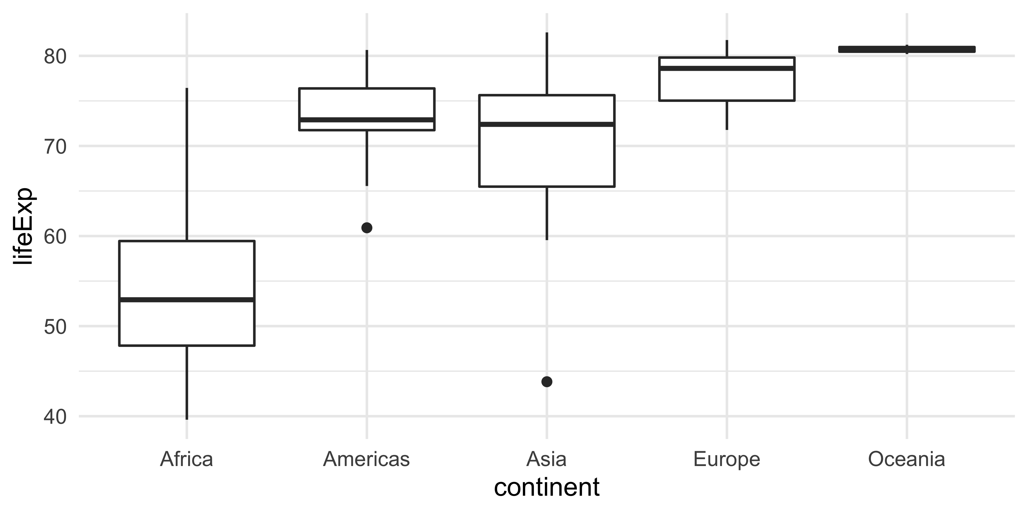
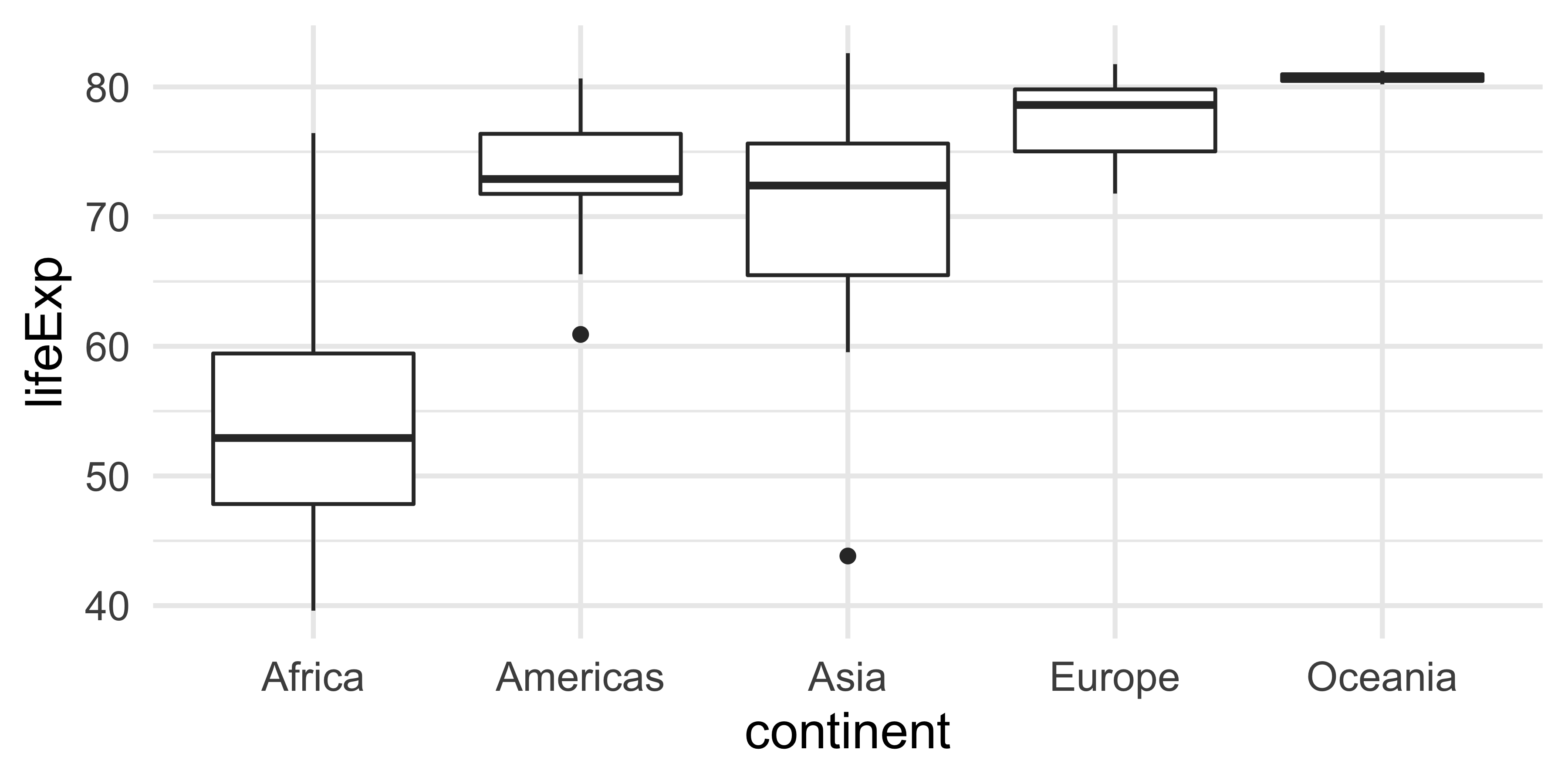
- Learners can apply a theme to control font types and sizes within a plot
Research project report
GitHub issues / Slack
[TODO: List of aggregated questions and answers]
Solving coding problems
Tipps for search engines
- Use actionable verbs that describe what you want to do
- Be specific
- Add R to the search query
- Add the name of the R package name to the search query
- Scroll through the top 5 results (don’t just pick the first)
Example: “How to remove a legend from a plot in R ggplot2”
Stack Overflow
What is it?
- The biggest support network for (coding) problems
- Can be initimidating at first
- Upvote system
Workflow
- First, briefly read the question that was posted
- Then, read the answer marked as “correct”
- Then, read one or two more answers with high votes
- Then, check out the “Linked” posts
- Always give credit for the solution
Give credit
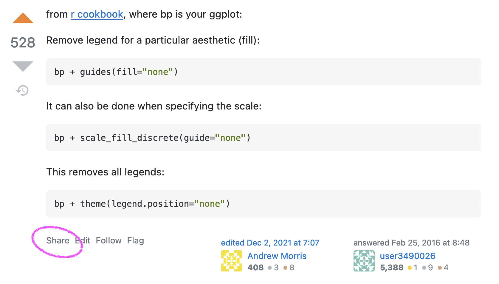
Give credit
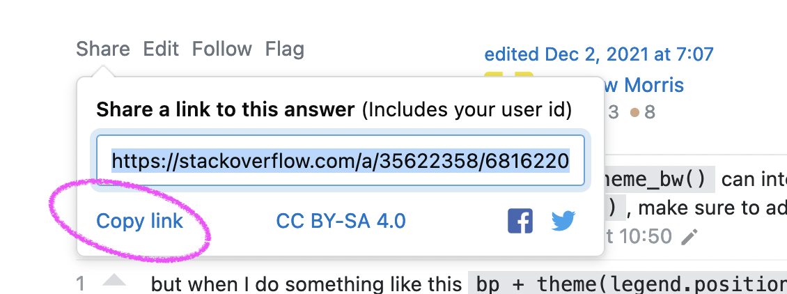
Give credit
Other sources for help
- RStudio Community Forum: https://community.rstudio.com/
- Our rbtl Slack channel
- Documentation websites: https://dplyr.tidyverse.org/
- Twitter community: #rstats

Minimal reproducible example (reprex)
- Needed when asking questions online
- We will practice this in another class
- Good support information: https://www.tidyverse.org/help/#reprex
.
Working collaboratively with git
pull first, and push often
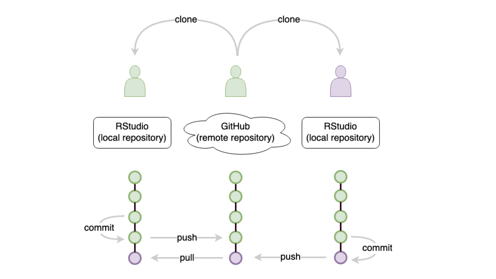
Live Coding Exercise
- Open the repo for your team project report on RStudio Cloud
- Open the file:
01-introduction.qmd - Use your Sticky Notes to let me know when you are ready.
Git help
You can find the merge conflict workflow documented in our git help document for the course:
The best online resource for working with git is:
Exploratory Data Analysis with ggplot2
R Package ggplot2
- ggplot2 is tidyverse’s data visualization package
gginggplot2stands for Grammar of Graphics- Inspired by the book Grammar of Graphics by Leland Wilkinson
- Documentation: https://ggplot2.tidyverse.org/
- Book: https://ggplot2-book.org
Code structure
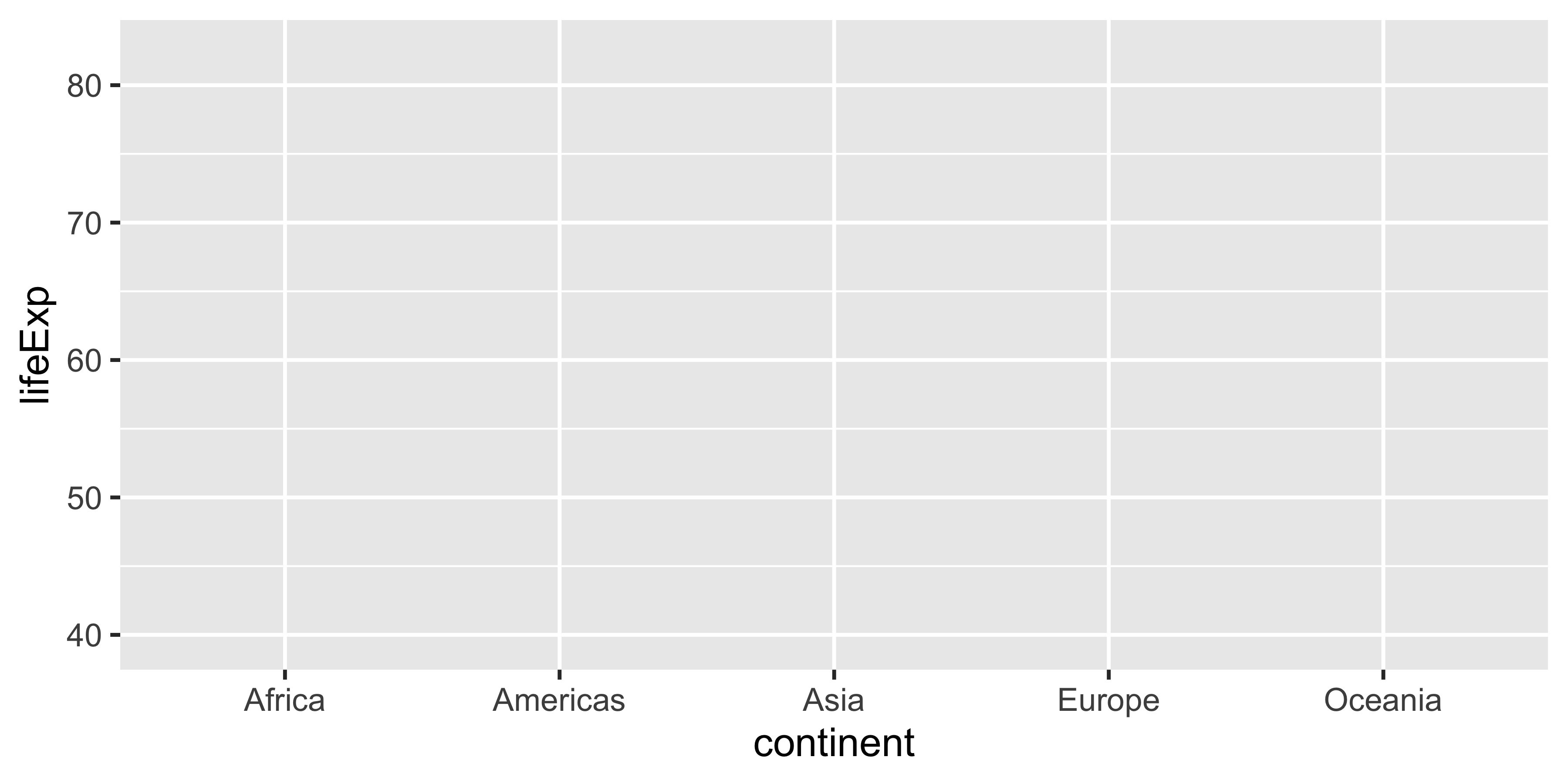
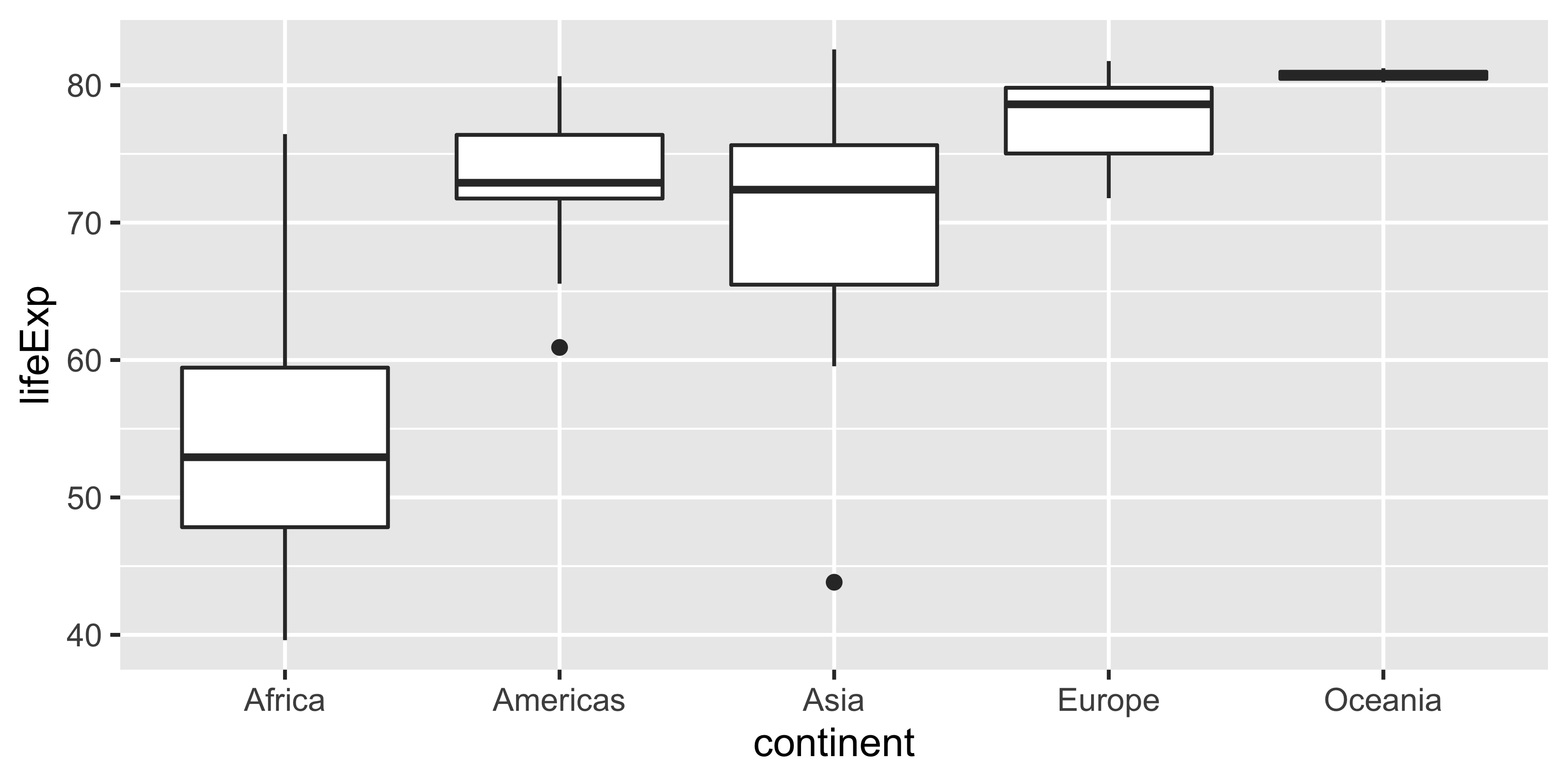
ggplot()is the main function in ggplot2- Plots are constructed in layers
- Structure of the code for plots can be summarized as
Code structure

Code structure

Code structure

Code structure
Code structure
Code structure
Code structure
Break

15:00
Live Coding Exercise - Goal
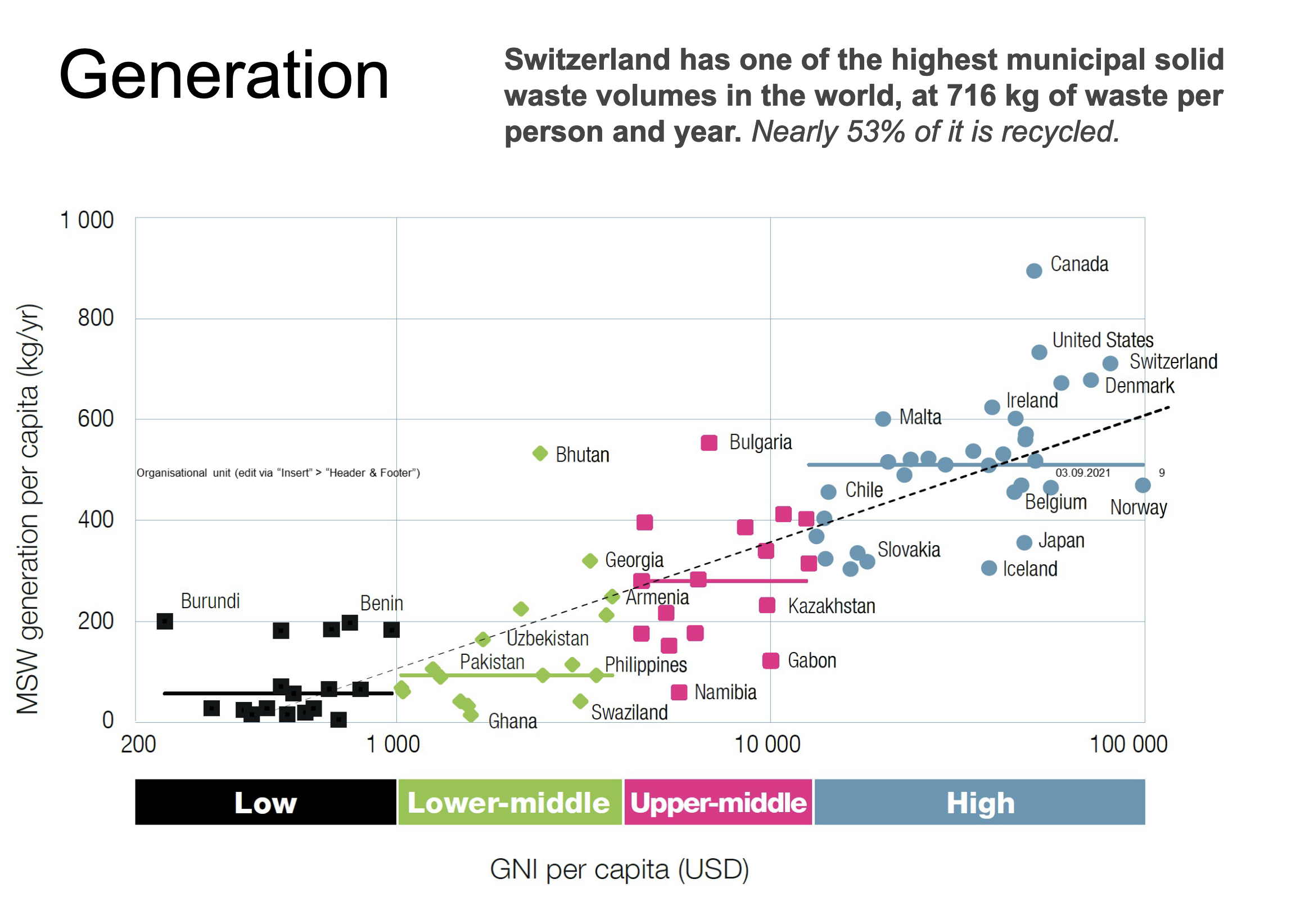
Live Coding Exercise
ae-11-data-science-lifecycle
- Head over to the GitHub Organisation for the course.
- Find the repo for week 11 that has your GitHub username.
- Clone the repo with your username to the RStudio Cloud.
- Open the file:
ae-11a-data-visualisation.qmd - Use your Sticky Notes to let me know when you are ready.
Break

10:00
Live Coding Exercise - Result
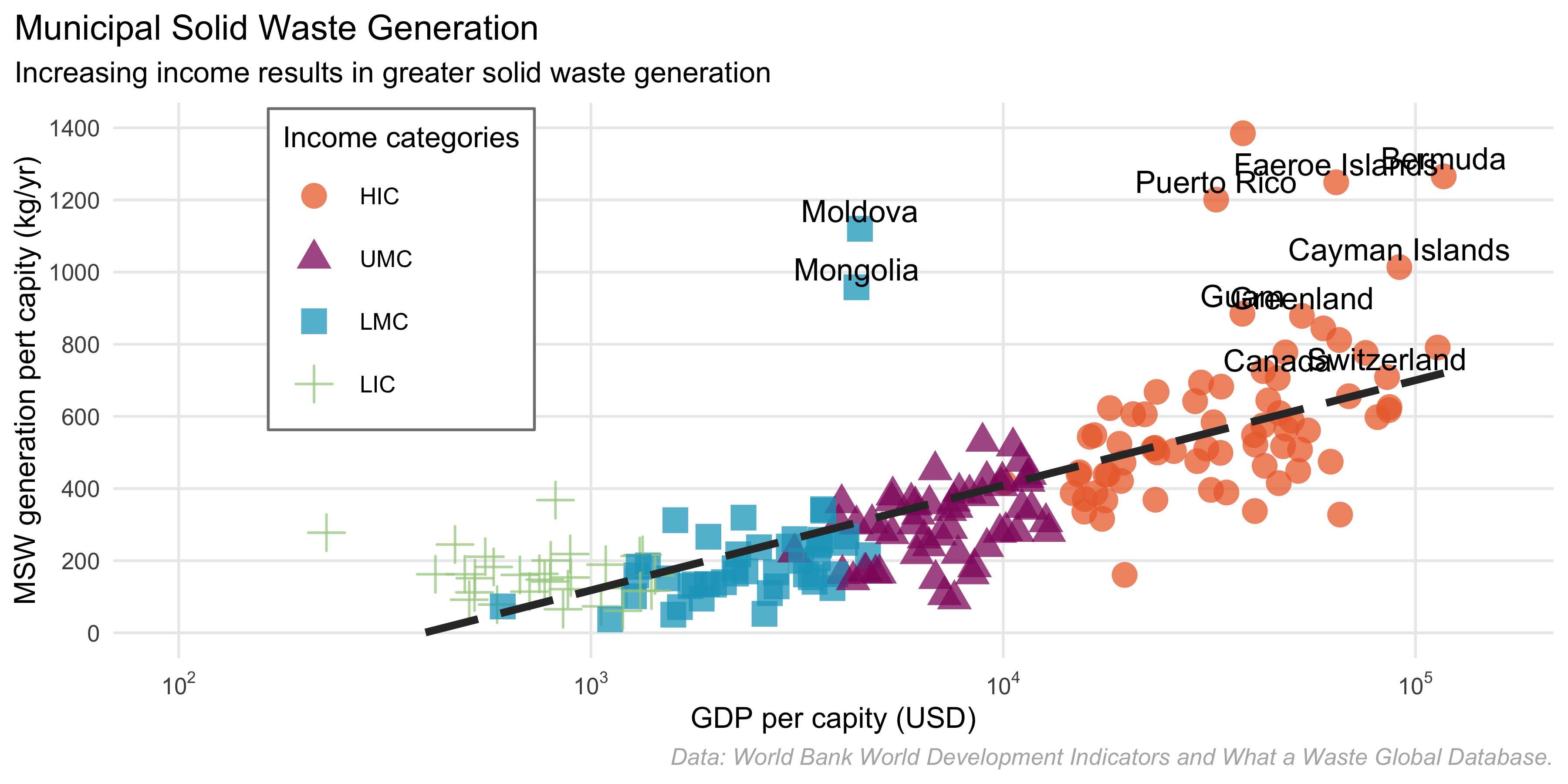
Visualising numerical data
Types of variables
numerical
discrete variables
- non-negative
- whole numbers
- e.g. number of students, roll of a dice
continuous variables
- infinite number of values
- also dates and times
- e.g. length, weight, size
non-numerical
categorical variables
- finite number of values
- distinct groups (e.g. EU countries, continents)
- ordinal if levels have natural ordering (e.g. week days, school grades)
data-to-viz.com
Homework Assignment
Submission
- All details in assignment week 11
- Due: Wednesday, 12th May at 23:59 (2 points)
Evaluation
- 5 mins
- anonymous
- after each lecture
Programming
ae-11-data-visualisation
- Open the file:
ae-11b-data-visualisation.qmd - Work through the exercises
- Use your sticky notes to indicate if you need support
30:00
Thanks! 🌻
Slides created via revealjs and Quarto: https://quarto.org/docs/presentations/revealjs/ Access slides as PDF on GitHub
All material is licensed under Creative Commons Attribution Share Alike 4.0 International.